Overview
A typical screen being drawn (illustrations)
Note: The screen images used in this topic are from Indigo Rose's Setup Factory 7.0. The actual screens seen here may not be available in Visual Patch.
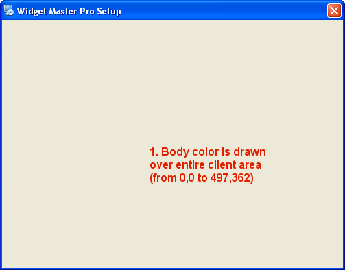
The entire client area (i.e. all of the window except the window border and title bar) is filled with the body background color.
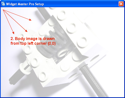
The body image is drawn in the upper left corner (0,0), starting from the upper left corner and extending towards the lower right.
(OPTIONAL) The banner is drawn. Depending on the banner setting, this consists of:
No Banner Style: (Banner style is "None")
3a. Nothing happens
Side Banner Style: (Banner style is "Side")
3a. The side banner image is drawn in the upper left corner (0,0), starting from the upper left corner and extending towards the lower right.
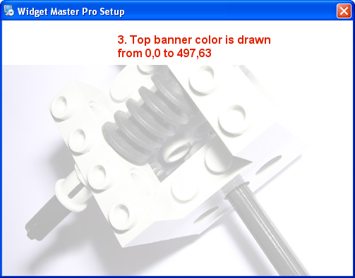
Top Banner Style: (Banner style is "Top")
3a. The top banner rectangle is filled with the top banner color.
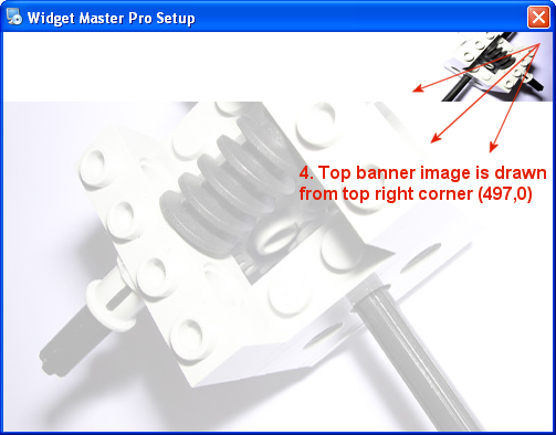
3b. The top banner image is drawn in the upper right corner (497,0), starting from the upper right corner and extending towards the lower left. (The upper right corner of the image will be at 497,0.)
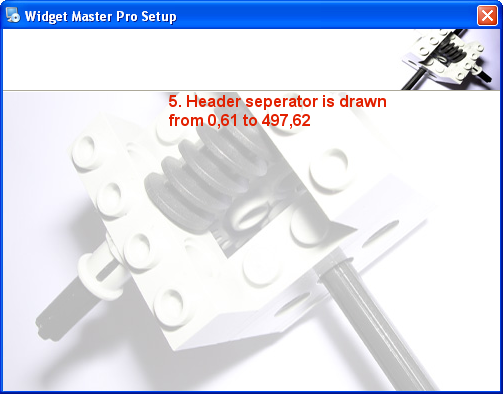
3c. (OPTIONAL) The header separator is drawn over the bottom two pixels of the top banner rectangle. (0,61 - 497,62)
Note: The header separator is only drawn if the header separator option is enabled.
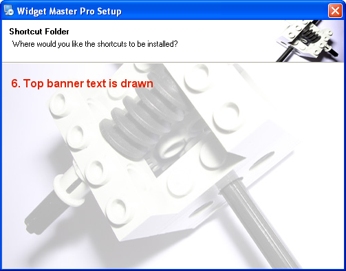
3d. The top banner text is drawn.
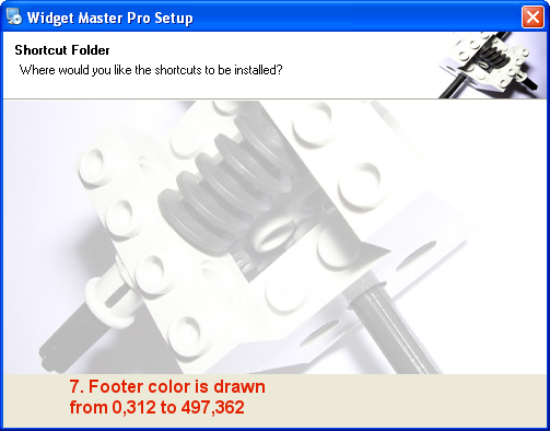
If the Fill Footer option is disabled (false), the footer rectangle is filled with the footer color. If the Fill Footer option is enabled (true), the footer rectangle is left uncolored so the body image is allowed to fill the footer area (if it's large enough).
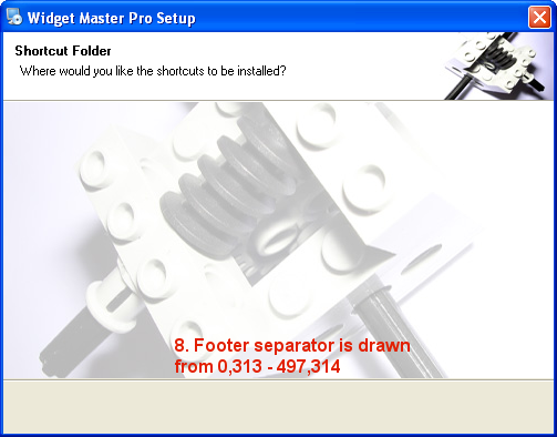
(OPTIONAL) The footer separator is drawn over the top two pixels of the footer banner rectangle. (0,313 - 497,314)
Note: The footer separator is only drawn if the footer separator option is enabled.
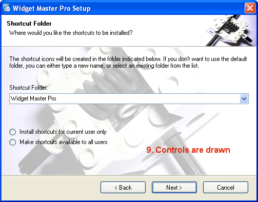
The controls (i.e. navigation buttons, screen controls, etc.) are drawn.
Note: If any of the images are larger than the screen, they will be cropped to 497x362 during the build process (i.e. the parts that extend beyond the window are cut off) in order to shorten load times and reduce storage space at run time.
The following nine illustrations demonstrate the steps involved in displaying a typical Select Shortcut Folder screen in the "top banner" style.
Note that the side banner image and the top banner image can be any size up to 497x362. In fact, the side banner image and the top banner image can be as large as the body image and cover the whole screen. This allows you to create themes that have a completely custom look across the entire screen for each of the three banner styles. Simply create three 497x362 images: a body background image, a side banner image, and a top banner image. The body background image will be used for the "no banner" style, the side banner image will be used for the "side banner" style, and the top banner image will be used for the "top banner" style.
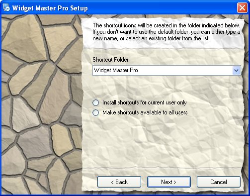
For example, here is a theme that uses a full-size side banner image to put a custom background behind the screen's control area:
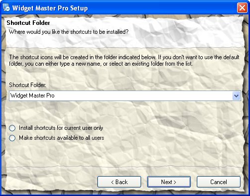
The theme's top banner image also covers the whole screen to create a different effect that matches the way the controls are laid out when the top banner style is used:
The theme's body background image on its own provides a suitable backdrop for the layout of the "no banner" style:
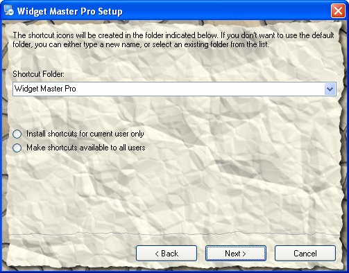
Note: The body background image is drawn for all three banner styles (none, side and top)...in the theme pictured above, the side banner image and the top banner image are drawn on top of the body background image, blocking it out.