Chapter 3: Creating the User Interface
Creating the User Interface
Creating the user interface (or UI) is one of the most important aspects of any setup since the UI is the first thing your end users will see when they run your installer. Making a great first impression with a good-looking UI is something that all users of Setup Factory should be concerned about.
This chapter will introduce you to the user interface and get you well on your way to creating a sharp and consistent look and feel for all of your projects.
In this chapter, you'll learn about:
The user interface
The background window
Screens
Themes
Taskbar settings
Dialog and Status Dialog actions
You can think of the user interface (UI) as any part of the setup that the end user will see. When a screen is displayed, the end user is seeing part of the user interface. When the end user clicks the Next button, the end user is interacting with the user interface.
The basic elements of the user interface are:
The Background Window
Screens
Themes
Taskbar visibility
Any actions that generate a UI element (e.g. Dialog.Message, StatusDlg.Show)
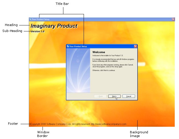
The background window is a maximized window that will appear behind all screens in your installation. Its main use is to focus the end users attention on your setup by blocking out the rest of the desktop.
The settings for the background window can be found in the menu under Project > Background Window. The next few sections will explain all the settings available for the background window.
The window style options control the title bar and border styles that will be applied to the background window. All background windows will be full screen and will cover the task bar regardless of the style you choose.
There are three different window styles:
Standard
Bordered
Kiosk
The standard window style will display a background window with the features of a normal window (i.e., a title bar with a close button and a standard window border).
You should probably choose the standard window style if you want to present your setup and background window as a standard application. The full background window allows you to display extra information, but the border makes it known to the end user that this is just a standard application.
The standard window style also lets the end user move the background window by dragging the window via the title bar.
Note: The text on the window title bar is controlled by the %WindowTitle% session variable.
The bordered window style has the same border as the standard window style but does not have a title bar.
The bordered style is a good choice if you do not want the end user to be able to move your background window, but you still want them to know that your installation is just another application (made clear by the border).
The kiosk window style will create a background window without a title bar or border.
This is an effective style to choose if you want an unmovable background window that thoroughly engages the end users attention. Because there is no border or title bar to differentiate your installation from the rest of the operating system, there is nothing to compete with your background window.
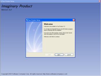
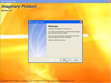
The window appearance settings control the appearance of the background window. These options control what the interior of the background window will look like. You can think of the interior of the background window as everything but the title bar and the border.
There are three appearance options: solid color, gradient, and image.
The solid color option will color the interior of the background window a single color.
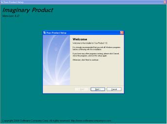
The gradient option will create a vertical gradient on the interior of the background window. The left color picker selects the color for the top of the background window and the right color picker selects the bottom color.
The image option will use the image that you select to fill the interior of the background window.
The image you select will be stretched to fill the interior of the background window regardless of its size. This means that your image will vary in appearance on computers with different screen resolutions. It is very important to select an image that will look good at different sizes.
The background window text settings control the look and position of the text that can be displayed on the interior of the background window.
Three separate text elements can be displayed on the background window: a heading, a subheading, and a footer. Each of these has similar formatting options, including the font type, the color of the text, whether to draw the text in a 3D style, the 3D color (if enabled), and the alignment of the text.
The heading text will be displayed at the top of the interior of the background window. It is usually used to display important information such as the name of your product or your computer name.
The subheading text will appear directly below the heading text and can contain your products version number, a marketing message, or any other message.
The footer text will appear at the bottom of the interior of the background window and is useful for displaying copyright information or website addresses.
The most important aspects of your user interface are the screens that you choose to display, since this is where your end user will actually interact with the setup. Screens allow you to provide important information (such as your license agreement) and allow your user to make decisions (such as where to install your product).
Screens are the individual windows that make up your installation. When you navigate through an installation by clicking the Next and Back buttons, you are navigating from screen to screen.
Tip: You can think of the screens in your project as steps in a wizard, walking your user through the process of installing your software.
In general, each screen performs a single task, like showing a welcome message, allowing the end user to select which packages they want to install, or letting the end user select the name of a shortcut folder. If you want to perform a major setup task, chances are you will need a screen to do so.
The screen manager is where you will configure all of your screens. There are two screen managers in Setup Factory: one for the installer (Project > Screens) and one for the uninstaller (Uninstall > Screens).
Aside from when the screens will be displayed, the only difference between the two screen managers is that the uninstallers screen manager does not allow you to configure the project theme.
Note: The project theme chosen in the installation screen manager affects your entire project and will be applied to screens in both the installer and uninstaller.
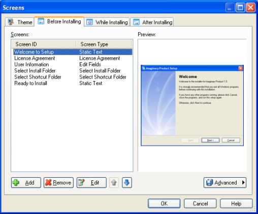
There are six stages at which screens can be displayed in Setup Factory. The first three stages are related to the installation, and the last three are related to the uninstallation.
The three installation stages at which screens can be displayed are:
Before Installing
While Installing
After Installing
The three uninstallation stages at which screens can be displayed are:
Before Uninstalling
While Uninstalling
After Uninstalling
Each screen stage is represented by a tab on the appropriate screen manager.
You will notice that the installation and uninstallation stages are very similar. In fact, the only difference between them is when they occur, i.e. during the installation or during the uninstallation.
Once you understand how the installation stages work, you can apply the same knowledge to the uninstallation stages. That being the case, the following section describes the installation stages only; however, the information is easily applicable to the uninstallation stages by substituting the word uninstall wherever you read install.
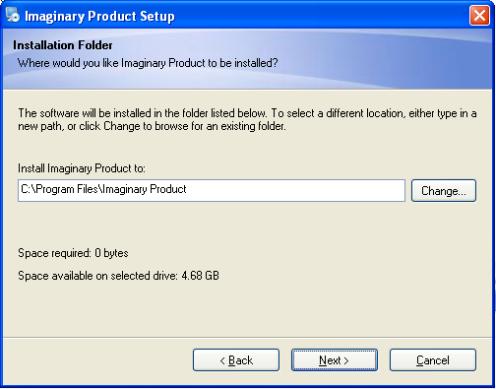
The Before Installing screens are displayed before the actual installation of any files occurs. In general, if the end user cancels the setup during this stage, no files will be installed on their computer.
This stage is used to perform such tasks as displaying your license agreement and allowing the end user to select where your product will be installed.
The While Installing stage occurs while the files are being installed onto the end users computer. This stage differs from both the Before Installing and After Installing stages in that only one screen can be displayed (as opposed to a sequence of screens), and it must be a progress screen.
This stage is used to display the file installation progress as it occurs. In other words, while your files are being installed onto the end users computer, the screen you chose for the While Installing stage will display information about the progress of that installation, such as what file is being installed, what percentage of all files has been installed so far, and what percentage of the current file has been installed.
The After Installing stage is the final screen stage and occurs after all of the files have been installed onto the end users computer.
This stage is typically used to show a reboot advisement (if needed), provide any post-installation instructions, and inform the user that the installation has finished successfully.
Adding a screen to your setup is as easy-you just click the Add button at the bottom of the screen manager.
Note: The While Installing screen stage is different since a maximum of one screen is allowed. For this stage, the button is labeled Change instead of Add.
Clicking the Add button brings up a screen gallery where you can select from a variety of screen types. Once you've selected the type of screen you want, simply click the OK button to add it to the list of screens for the stage that you're currently working on.
To remove a screen from your installation, simply select it in the screen list and click the Remove button.
Tip: If you remove a screen from your installation by accident, you can undo the deletion by pressing CTRL + Z.
In general, the order in which screens appear in the screen manager will be the order in which they appear during that screen stage. The screen that is at the top of the list will appear first and the screen that is at the bottom of the list will be the final screen of that stage.
To change the order of your screens, simply select a screen in the list and click the Up or Down button until its in the desired location. Or, if you prefer, you can simply drag the screen from one position to another.
Tip: You can also use the cursor keys to move a screen up or down in the list. Simply select the screen you want to move, and press Alt+Up or Alt+Down.
To edit a screens properties, just select it in the list and click the Edit button.
Clicking the Edit button opens the Screen Properties dialog where you can edit and customize all of the settings for that screen.
Tip: You can also edit a screen by double-clicking on it in the list.
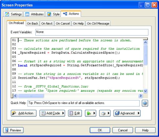
The Screen Properties dialog is where you can edit the properties of a specific screen. All Screen Properties dialogs have the same four tabs (although the specific content on these tabs may differ): Settings, Attributes, Style and Actions.
The Settings tab allows you to edit properties that are specific to the selected screen. Each screen type has different settings that are specific to that type of screen.
For example, a Check Boxes screen will have settings that apply to check boxes on its Settings tab.
For more information on the specific screen settings, please see the program reference.
The Attributes tab contains settings that are common to all screens. The only differences that you will find between Attributes tabs are that progress screens lack options for the Next, Back, and Help buttons. (Those buttons don't exist on progress screens.)
The Attributes tab is where you can configure which banner style to use, the name of the screen, and the navigation button settings.
The Style tab is where you can override the project theme on a per-screen basis. By default the project theme is applied to all screens throughout your project, however there might be some instances where you feel a certain screen needs something a bit different in order to stand out. You can use the Style tab to override any of the theme settings on a specific screen. (The changes will only be applied to that screen.)
The Actions tab is where you can edit the actions associated with the screens events.
For more information on actions and events, please see the help file and Chapter 4.
The Settings and Attributes tabs both have a language selector in the bottom right corner. The language selector is a drop-down list containing all of the languages that are currently enabled in the project. It is used for creating multilingual installations.
Selecting a language in the list allows you to edit the text that will be used on the screen when that language is detected.
Note: Unlike previous versions of Setup Factory, the language selector allows you to display different text on a screen for specific languages without having to create a separate screen for each language.
Session variables play a large part in the way that screens work and how they display their text. Anytime you see something in Setup Factory that looks like %ProductName%, what you are looking at is a session variable.
Note: A session variable is essentially just a name (with no spaces) that begins and ends with %.
Session variables are very similar to normal variables in that they serve as containers for values that may change. We say that values are assigned to or stored in session variables. When you use a session variable, its name (i.e. %ProductName%) is replaced at run time by its value (i.e. Setup Factory). Session variables are basically placeholders for text that gets inserted later.
Session variables are often used in the default text for screens. They are automatically expanded the first time the screen is displayed, so instead of seeing %ProductName% on the screen, the end user will actually see the name of your product that you entered in the session variable editor: Project > Session variables.
Session variables are also used to store return values when screens or controls need them. For example, the Select Install Folder screen stores the installation folder path in a session variable named %AppFolder% by default.
Tip: Session variables can be created and changed at run time using actions like SessionVar.Expand, SessionVar.Get, SessionVar.Remove, and SessionVar.Set.
For more information please see Chapter 5, which discusses session variables in more detail.
Screen navigation can be thought of as the path that the end user takes through your installation. The end user navigates forward through various screens by clicking the Next button, and backward through the screens by clicking the Back button.
Screen navigation is basically a linear path from the top of your screen list in the screen manager to the bottom. Generally, the order of your screen list in the screen manager is exactly the order in which the navigation will proceed.
Although there are other ways to control the path through the screens (e.g. using actions to create a branching path), in most cases the default behavior is all that is needed.
In its simplest form, screen navigation is when the end user moves forward or backward through your installation by clicking the Next and Back buttons. By default, this moves the end user down or up through the list of screens on the screen manager.
This is actually accomplished using actions. Each screen has Screen.Next and Screen.Back actions on its On Next and On Back events which are performed when the Next and Back buttons are clicked. If you ever need to, you can modify or override the default behavior of any screen by editing or replacing the default actions. Most of the time, however, you will not even need to know that the actions are there.
Navigation buttons are the Back, Next, and Cancel buttons that are usually visible along the bottom (or footer) of each screen. The Next button moves the end user down the screen list from the top to the bottom, the Back button moves the end user up through the screen list, and the Cancel button stops the users navigation by canceling the installation.
The settings for these buttons can be found on the Attributes tab of the screen properties dialog for each screen. There you can change the text, enabled state and visible state of these buttons.
The two options for the visibility state are self-explanatory; they make the button either visible or invisible. The two options for the enabled state make the button enabled or disabled. If a button is in the enabled state, it looks and functions like a normal button; it will depress when the user clicks on it, and the text is displayed in its normal color (usually black). When a button is in the disabled state, however, it will not respond to the users mouse, and is typically drawn in less prominent gray colors (also known as being ghosted or grayed out).
Each navigation button has an event that will be fired when the button is clicked. These events can be found on the Actions tab of the screen properties dialog.
Note: A Help button is also available on the footer of each screen but is generally not considered a navigation button.
An event is something that can happen during the installation. When an event is triggered (or fired), any actions that are associated with that event are performed. Note that an event must be triggered in order for its actions to be performed-if an event is not triggered, the actions associated with it will not be performed.
Each event represents something that can happen while your installation is running. For example, all screens have an On Preload event, which is triggered just before the screen is displayed. To make something happen before a screen is displayed, you simply add an action to its On Preload event.
All of the three navigation buttons have an event that will be fired when they are clicked. The events are On Back for the Back button, On Next for the Next button and On Cancel for the Cancel button.
In the case of the three navigation buttons, navigation actions are executed when their respective events are fired. This allows the end user to navigate through the installation from the beginning to the end.
There are other events that are associated with screens but aren't necessarily related to screen navigation:
On Preload just before the screen is displayed.
On Help when the help button is selected.
On Ctrl Message triggered by a control on the screen.
There are six navigation actions available to you in Setup Factory: Screen.Back, Screen.End, Screen.Jump, Screen.Next, Screen.Previous, and Application.Exit. The most common of the six actions are Screen.Next and Screen.Back.
When the Next button is clicked, the end user is attempting to navigate from the current screen to the next screen or phase of the installation. The easiest way to implement this behavior is to insert the Screen.Next action on the On Next event. This is done by default for all screens.
The same holds true for the Back button; when the Back button is clicked, the end user is attempting to move backwards in the installation to the previous screen. To implement this behavior, a Screen.Back action needs to be executed when the On Back event is fired.
Note: The Screen.Back action moves backward in the installations history in the same way that a Back button does in a web browser. To move up (back) one screen in the screen list, use the Screen.Previous action.
In certain situations, simply moving down the screen list is not the appropriate behavior; instead, jumping to a specific screen in the screen stage is necessary. You can accomplish this by using a Screen.Jump action. If the goal is to jump to the next phase in the installation- i.e., to end the current screen stage a Screen.End action can be used to jump past all of the screens in the current screen stage.
To interrupt screen navigation, which usually occurs when the Cancel button is clicked, you can use an Application.Exit action. The Application.Exit action causes your installation to stop as soon as it is performed.
Note: For more information on the specifics of screen actions, please see the program reference.
In Setup Factory choosing a layout for your screens and the controls is simple. You can switch between all three banner styles (top, side, and none) on any screen that you like, and the controls on your screens will dynamically position themselves ensuring that all of your information is visible.
Note: A control can be thought of as the visible elements on a screen, from edit fields, to radio buttons, to static text controls. However, when the term control is used, it does not generally refer to the navigation buttons or banner text.
Screens in Setup Factory are divided into three basic parts: the header, the body and the footer.
The header runs across the top of each screen and can be thought of as the area that the top banner fills.
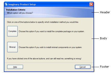
The footer is similar to the header area except that it runs along the bottom of each screen. This is the area of the screen where the navigation buttons are placed.
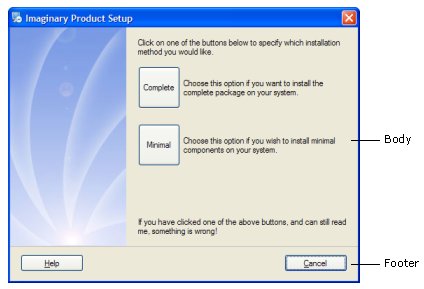
Now that you know what the header and the footer are, you can think of the body as the rest of the screen. The body of a screen takes up the majority of each screen and will contain most of the screens information.
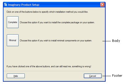
In Setup Factory the term banner refers to an area of the screen that is special and somewhat separate from the rest of the screen. You can use the banner area to display some descriptive text, an image, or both.
There are three different types of banner styles available in Setup Factory: none, top, and side.
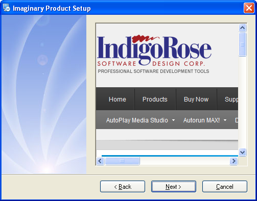
The none banner style is the easiest of all three styles to understand since it means that there will be no banner displayed on the screen as seen below.
The top banner style will give you a long thin banner across the top of your screen (the header). This is the style that you will probably apply to the majority of the screens in your project. The top banner style supports two lines of text referred to as the heading text and the subheading text. This text is usually used to describe the current screen and/or provide some information about what is required of the end user.
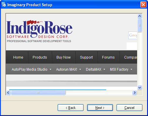
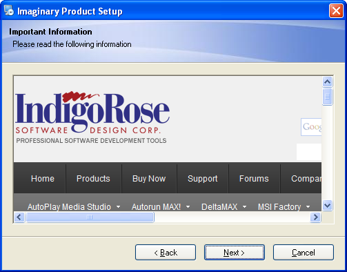
The top banner style also supports an image that will be placed on the right hand side of the banner. Setup Factory will resize this image proportionally so that its height matches the height of the top banner. The width of the image can be as wide as you want and can take up the entire banner if necessary.
Any area of the top banner that is not covered by an image will be painted with a color according to the project theme as seen below.
The side banner style will give you a thick banner that runs down the left side of your screen. The side banner will start at the top of the screen and then stop at the top of the footer of your screen. The side banner style supports an image that will automatically be stretched or resized by Setup Factory to fill the entire side banner area as seen below.
One of the best features in Setup Factory is the dynamic control layout ability of screens. Setup Factory will dynamically reposition the controls on your screen so that the maximum amount of information stays visible.
Dynamic control layout means that controls will resize and layouts will adjust automatically as you type. You no longer have to manually place your controls and you wont find yourself locked into a pre-determined amount of space; dynamic control layout means that the layout will be automatically chosen based upon your chosen control settings.
The dynamic repositioning of controls takes place within an area called the control area. The control area of a screen occupies a sub-section of the body of a screen; its size is controlled by the global theme.
The best part of the dynamic control layout feature is that it works without any effort on your part. Simply fill your screens with all of the information and controls that you desire, and Setup Factory will re-position all the controls so that everything is visible and a visually appealing look is achieved.
This is not to say that you do not have any control over how controls will be displayed on your screen; in fact, its just the opposite. Many screens (Edit Fields, Checkboxes, etc.) allow you to add as many as 32 controls to your screen, which Setup Factory will dynamically position. You have the ability to choose how many columns you want the controls displayed in, whether they are distributed horizontally or vertically and, in the case of the Edit Fields screen, how many columns each control spans!
If this seems a bit confusing, don't worry about it. The best way to understand the dynamic control layout feature is to use it. Try playing around with the settings of the Check Boxes or Select Install folder screens and observe how Setup Factory positions your controls to achieve the best look possible.
Tip: You can also add a custom screen to your project. A custom screen allows you full control over the number, position and types of controls you include in your screen. It is available in the screen gallery. For more information on custom screens please refer to the program reference.
A theme is a group of settings and images that control the way your installation looks. You've probably encountered themes before when using other applications or even Windows. Themes do not change what is displayed; instead, they change how it is displayed.
Themes in Setup Factory control the general appearance of your screens and the controls they contain. Rather then controlling the position of screen controls or the banner style used, themes control the color and font of screens and controls. Themes are project-wide and affect all screens in the installation and uninstall unless intentionally overridden on the style tab of the screens properties.
Themes provide an easy way to change the look and feel of your screens and controls without having to go to each screen and update it every time you wish to apply a new visual style.
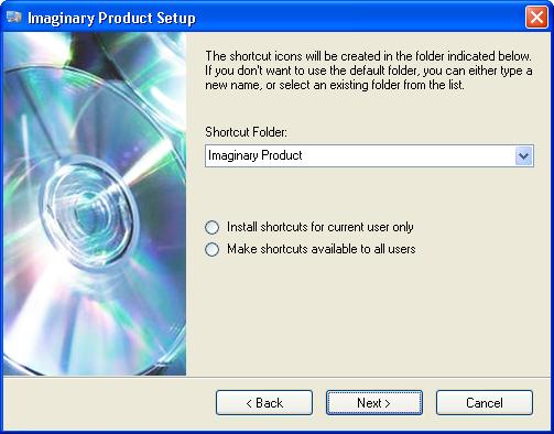
Below is a Select Shortcut Folder screen with the "CD-ROM" theme applied:
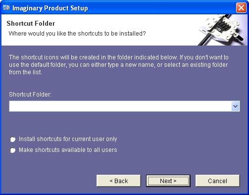
The same screen with a custom theme applied:
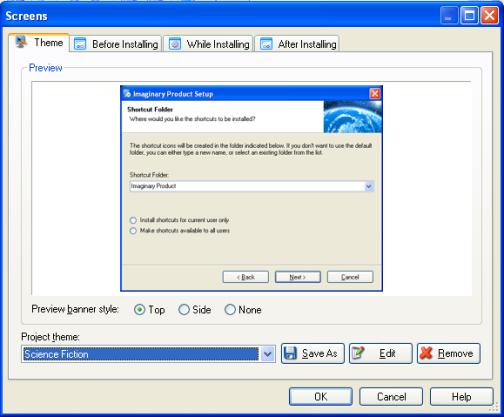
You can choose a theme for your project on the theme tab of the installation screen manager, which you can access by choosing Project > Screens.
A list of the available themes will be found in the project theme drop down. Selecting a theme in this drop-down list will apply the theme to all screens in your installation and uninstallation.
For your convenience Setup Factory provides a handy preview of the theme on the theme tab so that you will know what the theme looks like before you choose it.
As introduced above, themes affect the appearance of screens and their controls. For example, choosing a theme that colors all static text controls purple will result in all static text controls being purple, and choosing a theme that colors static text controls black will result in all static text controls being colored black.
Setup Factory allows you to create your own custom themes. This provides you with an easy way to share the same custom look and feel between multiple projects.
Here is a brief step-by-step guide to help you in the creation of a custom theme.
Start a new project by choosing File > New Project from the menu, then open up the theme settings by choosing Project > Screens making sure that the theme tab is selected.
The first step in creating a custom theme is to select a theme from the project theme drop down that you will use to base your new theme upon. If you cannot find a suitable theme, your best choice will be the default theme.
Once you have selected the theme that will be the basis for your new theme, use the Save As button in order to save a copy of the current theme.
Make sure that your new theme is selected and press the edit button to bring up the theme properties dialog. Here you will be able to edit all of the properties of your theme. Once you have made all of your changes, simply press the Ok button and the changes to your theme will automatically be saved.
Now you have a working theme that will be available to you in all your Setup Factory projects.
Note: If you are not happy with the changes made while editing your theme, simply click the Cancel button and your changes will not be saved.
Note: Saved themes will be stored in a Themes folder located in the all user profile of Application Data. For example: C:\Documents and Settings\All Users\Application Data\IndigoRose\Setup Factory\9.0\Themes.
As stated earlier, project themes affect every screen in your installation and uninstall. While in the vast majority of situations this is the desired effect, there may be a few instances where this is not exactly what you want. Fortunately, Setup Factory allows you to override any or all of the theme settings on any of your screens.
As mentioned in the Screen Properties section, each screen has a style tab associated with its screen properties dialog. If you look at the Style tab you will notice that it looks identical to the Style tab on the theme properties dialog except that it has a checkbox in the top left corner labeled override project theme.
Enabling the override project theme option will enable the theme settings area and allow you to change any or all of the theme settings without affecting any of the other screens in your project.
Note: If you decide that you want to go back to the project theme on a screen where you have overridden the project theme, there is no need to re-create the screen. Simply go to the Style tab and uncheck the override project theme checkbox.
There are a few other options in Setup Factory that relate to the user interface of your installation. These options may not be as important as screens or themes but just might provide the elements necessary to perfect your projects look and feel.
The taskbar is the bar that runs across the bottom of all modern Windows operating systems beginning with the START button on the left. When a program is running, its icon and name will generally appear in a button in the taskbar.

Setup Factory allows you to choose whether or not to show an icon in the task bar and to choose what that icon will be. Both of these settings can be found on the Advanced tab of the project settings: Project > Advanced Settings.
To hide the taskbar icon simply check the hide taskbar icon checkbox on the Advanced tab. To choose a custom icon simply check the use custom icon checkbox to turn on the custom icon setting and then click the browse button to locate the icon of your choice.
Note: If you configure your installation to be a silent install in the advanced settings then no taskbar entry will appear.
Some of the actions available to you in Setup Factory are capable of showing user interface elements. These actions can be divided up into two main categories: Dialog actions and Status Dialog actions.
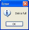
Dialog actions are used to show pop up dialogs to the end user. Examples include the Dialog.Message action that lets you display a message in a dialog, and the Dialog.TimedMessage action that lets you show a dialog with a message for specific amount of time.
A typical message dialog:
Status dialogs are the other main user interface elements that are available to you through scripting. Status dialogs are mainly used to show progress or status during a lengthy event like an HTTP.Download action or a File.Find action.
A Status dialog:
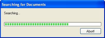
Status dialogs are shown and configured using actions like StatusDlg.SetMessage, StatusDlg.ShowProgressMeter, and StatusDlg.Show.
Note: It is generally recommended that progress be shown in a more integrated manner using a progress screen, however there are situations where a status dialog may be more appropriate.
Note: For more information on the Dialog and StatusDlg actions, please see the program reference.