
Overview
A combo box control, commonly referred to as a "drop down," can be used to present a list of selectable options while consuming a minimal amount screen space. A combo box is a combination of a drop down menu with an edit field to display the user's selection. An example of a combo box both in its normal and expanded view can be seen below:
A typical combo box control:
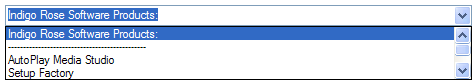
After clicking on the combo box to access its drop-down list:
Additional features of the combo box control can be found in the following two categories:
A notification message is triggered whenever the user interacts with a control, or whenever user interaction affects a control in some way. Each notification message consists of a number that identifies the type of interaction that has occurred, and a table containing details specific to that type of interaction. These two values are passed to the screen's On Ctrl Message event as the event variables e_MsgID and e_Details.
Note: Notification messages are not triggered when actions interact with this control.
(number)
e_MsgID
A numeric constant that represents the specific notification message that
was fired by the screen control. See the e_MsgID column below for all
possible message ids that can be fired by a combo box control.
(table) e_Details
A table of additional details that may be passed by the control when certain
notification messages are fired. See the e_Details column below for the
kinds of details that are returned and the table indexes that you can
use to access them. For example, you can access the item "Text"
from this table by using e_Details.Text.
|
e_MsgID |
e_Details |
Description |
|
MSGID_ONCHANGED |
(string) Text - The new text of the control |
Fired when the text changes in the combo box edit field. |
|
MSGID_ONSELCHANGED |
(number) CurSel - The (1-based) index of the current selection. (string) Text - The text of the selected item. |
Fired when the selection changes. |
The following actions are available for interacting with a combo box control: