
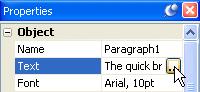
Scrolling text is just text that can be scrolled, either vertically, horizontally, or in both directions. In AutoPlay, scrolling text can be displayed by using a paragraph object, which has built-in support for vertical and horizontal scroll bars.
Scrolling text is useful whenever you want to display more text than you can fit in a given space. For example, if you need to display a long license agreement, or the contents of a readme.txt file, or an article on cubicle horticulture penned by your favorite geek auteur.
In this lesson, you’ll learn how to:
• Add a panel image to serve as a backdrop and border for some text
• Replace the text in a paragraph object by shift-dragging a text file
• Add a scrollable paragraph object
• Use a custom scroll bar style
This lesson takes approximately
15 minutes to do.
If you’re continuing from Lesson 5, you should still have AutoPlay running with the Tutorial project open. If so, you’re ready to move on to the next exercise: Adding a Video Object.
Otherwise, you’ll need to open the project file that you saved at the end of Lesson 5.
When you save a project, AutoPlay automatically creates a project folder for it inside your “My Documents\AutoPlay Media Studio 6.0 Projects” folder. This project folder is where everything that belongs to the project is stored—including the project file, which contains all of the settings used in the project.
The project folder and the project file always have the same name that you gave to the project when it was created. The project file’s name ends with a “.am6” file extension.
Since you named this project “Tutorial” in Lesson 1, the name of the project folder will be Tutorial, and the name of the project file will be Tutorial.am6. So, the path to the project file should be something like:
...\My Documents\AutoPlay Media Studio 6.0 Projects\Tutorial\Tutorial.am6
To open the project, you just need to open that project file.
A panel image is just an image object that you put behind another object to achieve some kind of custom background or picture frame effect. Although you can use any image for this purpose, AutoPlay comes with a number of images that were designed to do just that.
Tip: You can order more panel images directly from our web site. There are literally thousands of such images available.
Panel images are especially helpful at providing a sort of “mini-background” behind a bunch of text, to make the text easier to read than it would be on the page background itself. (This comes in handy for those times when you’re using a really wild image for the page background.) They can also be used to provide a fancy border to “section off” an area of the page.
Note: The paragraph object has an optional border and background color, which can serve the same purpose as a panel image in many cases. For really cool, professional borders and backgrounds, though, a panel image is the way to go.
We’re going to add the panel image and the paragraph object to the About Ted page, so before you do anything else, click on the “About Ted” page tab at the top of the work area.
The Gallery pane is tabbed with the Project pane on the right side of the AutoPlay program window. You can switch between these tabbed panes by clicking on the appropriate tab.
Note: Earlier we made the Gallery and Project panes visible. If they are not visible, you can make them visible by using the View > Panes submenu.
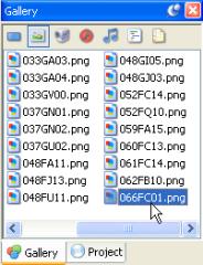
The Gallery pane lets you browse the library of files that came with AutoPlay. This library is organized into different sections, each one accessible with a button at the top of the pane. Clicking on the Images button at the top of the pane displays the gallery’s image collection.
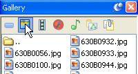
Like the Gallery tab on the Select File dialog, the Gallery pane remembers the last folder you accessed for each file type it contains. The last time you used the Gallery pane to add an image was in Lesson 2, when you used it to drag a background onto the page. Unless you’ve navigated somewhere else with it since then, the Gallery should still be “in” the Backgrounds folder.
To navigate to the Panels folder, you need to first move “up” one level by double-clicking on the up folder.
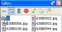
Once you’ve moved up one level, you can proceed to navigate into the Elements folder, and then into the Panels folder.
Note: Navigating in the Gallery pane is just like navigating in the Select File dialog, or in Windows. To reach the files inside a folder, just double-click on it.
As you can see, panel images come in a lot of different shapes, colors and textures. This is just a tiny sample of the panel images that are included in the add-on content packs that you can purchase from the Indigo Rose website.
When you’re picking an image to serve as a background for text, look for one that has a smooth texture, since “busy” patterns will make it harder to distinguish the letters. You want to pick one with colors that will contrast well with the color of the text. In this case, we’ll be using white text, so we don’t want to pick anything too bright; white text on a bright background would be difficult or even impossible to read.
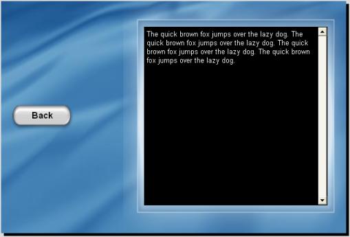
A good candidate for this project would be 066FC01.png. It has a solid black background in the middle that will contrast nicely with white text, and a nice shiny blue “frame” around it that will look good against the page background we’re using.
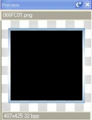
It also has a subtle “shine” effect around the edges of the frame. In order to achieve this lighting effect, the image was made a little bit larger than the frame on all sides. In fact, the image was sized to fit perfectly on a page that is 425 pixels tall—just like the pages in our project. This makes it really easy to position the image on our page.
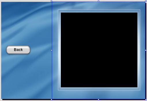
First, make sure Align to Page mode is on. (An easy way to do this is to right-click on the image, and choose Align. If Align to Page mode is on, the To Page item will have a box around it.) Then, right-click on the object and choose Align > Center Vertical. Finally, right-click on the object and choose Align > Right.
Voila! The image is now positioned perfectly on the right side of the page.
Tip: If View > Snap to Page is on, you can also just drag the object into place with the mouse, and it will “snap” into place as you approach the top right corner of the page.
Pinning the image object will make it easier to work “around” the object without moving it by accident. (We’ll be placing a paragraph object right on top of the image object.)
Tip: You can also pin an object by selecting it and pressing Ctrl+P.
The paragraph object has the built-in ability to display text that is longer or wider than the object itself, with scroll bars to let the user slide the “hidden” parts into view.
In fact, all you need to do to make a paragraph object scrollable is to put more text in it than it has room to display. (By default, new paragraph objects have their vertical scroll bar set to “Auto,” which means they will automatically display a vertical scroll bar if the text is long enough.)
There are two basic kinds of scroll bars: vertical, and horizontal. (Vertical scroll bars let you scroll text up and down, while horizontal scroll bars let you scroll text left and right.)
Vertical scroll bars are useful when you’re displaying long text documents—in fact, they let you put as much text in a paragraph object as you want. The size of the paragraph object just determines how many lines of text the user can see at any given time.
Horizontal scroll bars are useful when you’re displaying text with very long lines, and you don’t want the text to “wrap” at the right edge of the paragraph object. Instead, the user can drag the horizontal scroll bar left and right to see all of the text on a line. Although most people find this disconcerting, it can be useful for text that isn’t meant to wrap, such as text arranged in fixed-width columns, or program code samples.
Note: Most users don’t like having to scroll text horizontally. You should avoid using horizontal scroll bars unless you have a good reason to.
We want the paragraph object to have white text, and we don’t want the color to change whenever the user moves the mouse over it, so we need to make sure the Highlight and Click colors both match the Normal color.

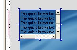
After you click OK, the paragraph object that was added in the upper left corner of the page will reflect the new settings. Notice that the sample text is in fact white, and the object has a vertical scroll bar.
Forcing the vertical scroll bar on regardless of the object’s size will make it easier to position the object in the next step, since the scroll bar affects the amount of room the text has, which in turn can affect where you want to place the object to “center” it on top of the panel image.
You want the paragraph object to be smaller than the panel image, so it will fit inside the blue frame that is built into the image.
Now let’s load some text into the paragraph object.
When you click on the edit button, the Edit Text dialog appears.
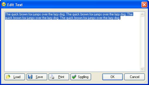
At the bottom of the Edit Text dialog, there are four buttons: Load, Save, Print and Spelling.
• The Load button lets you import text from any text file on your system.
• The Save button lets you save the current contents of the Edit Text dialog to a text file.
• The Print button lets you print the current contents of the dialog.
• The Spelling button interactively checks the spelling of the text, letting you choose from a number of suggested spellings for any misspelled words.
We could use the Load button to load a text file into the paragraph object, but since the file we want to load is in AutoPlay’s gallery, there’s an even easier way.
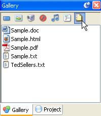
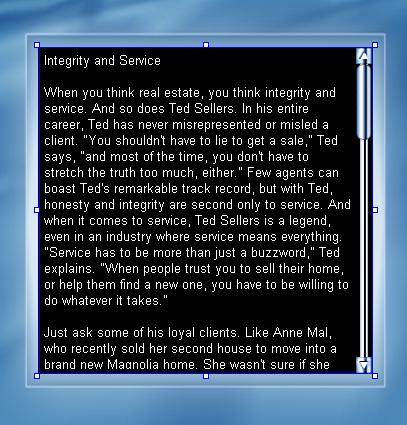
Clicking the Docs button displays the sample document files that are shipped with AutoPlay. The file we want to load into the paragraph object is TedSellers.txt.
Normally, when you drag a text file onto the page, a new paragraph object is created for you automatically—with the entire contents of the text file inside it.
That’s pretty darn cool. In fact, we could have used that method to create the paragraph object in the first place.
However, if you hold the Shift key down as you drag a text file onto a paragraph object, you’ll replace the text in the paragraph object with the text from the file.
Which you have to admit, is also pretty nifty.
When you drag the TedSellers.txt file onto the paragraph object with the Shift key held down, the contents of the TedSellers.txt file are instantly loaded into the paragraph object.
Tip: There are all sorts of little time-saving tricks like this built into AutoPlay. If you want to slip a few more of them up your sleeve—you know, just in case—just search for “Drag and Drop Assistant” in the help file.
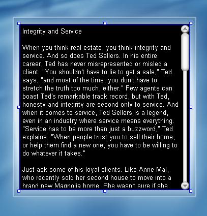
The paragraph object allows you to choose between a standard, Windows-style scroll bar, or a custom scroll bar style, like the cool Chrome one that comes with AutoPlay.
Go ahead and pick whichever scroll bar style looks best to you. (I chose Corporate, since it looks good with the dark background of the panel image we’re using.)
Each scroll bar style is actually just an image file with different “scroll bar parts” arranged in a row. Each individual part of the scroll bar is represented by a different section of the image. AutoPlay extracts the parts from this image, and then uses them to build the scroll bar.

The Corporate scroll bar skin
This kind of image file containing different interface parts is usually referred to as a skin file. Indeed, the scroll bar styles are similar to the skin files used by other “skinnable” programs, like Winamp.
Note: AutoPlay’s scroll bar images are located in the Plugins\Scrollbars subfolder, inside the folder where AutoPlay was installed. You can add more styles to the list of available scroll styles by copying compatible images into that folder.
Tip: You can also build your own scroll bar skins for AutoPlay using a paint program. The easiest way is to use one of the existing scroll bar images as a template. Simply make a copy of an existing skin file, and then modify the copy, replacing each section of the image with your own corresponding scroll bar part.
Trying It Out
Now that we have everything set up the way we want, let’s see some scrolling text in action.
It’s always a good idea to save the project before you preview it.
Pretty cool, isn’t it!
That’s it for this lesson.
Lesson 6 Summary
In this lesson, you learned how to:
• Add a panel image to serve as a backdrop and border for some text
• Add a scrollable paragraph object
• Replace the text in a paragraph object by shift-dragging a text file
• Use a custom scroll bar style