This lesson will introduce you to objects, the basic building blocks that make every AutoPlay application unique. The two easiest objects to use are images and labels. Together, they let you populate your project with graphics and text. Although they're simple to use, they allow you to do some very advanced things, and by the end of this lesson, you'll be well on your way to manipulating these objects like a pro.
Most of the skills you'll learn in this lesson can be applied to all of the objects you'll use in AutoPlay, so pay attention, this is very useful information. For instance, all of the objects in AutoPlay can be resized and repositioned freely, and in this lesson you'll learn how to do that. You'll also learn how to rename objects, and how to quickly create a clone of an existing object by duplicating it...a real time saver that you'll find yourself using time and time again.
What You'll Learn
In this lesson, you'll learn how to:
Change the page background
Add an image object
Resize objects
Add label objects
Duplicate objects
Change the text in a label object
Rename objects
Use custom font settings
Use different text colors
Copy a color from one object to another
Match an objects normal, highlight and click colors
Save the project
Preview the project
This lesson takes approximately 45 minutes to do.
Starting the Lesson
If you're continuing from Lesson 1, you should still have AutoPlay running with the Tutorial project open. If so, you're ready to move on to the next exercise: Choosing a Page Background.
Otherwise, you'll need to open the project file that you saved at the end of Lesson 1.
When you save a project, AutoPlay automatically creates a project folder for it inside your My Documents\AutoPlay Media Studio 8\Projects folder. This project folder is where everything that belongs to the project is stored, including the project file, which contains all of the settings used in the project.
The project folder and the project file always have the same name that you gave to the project when it was created. The project files name ends with a .autoplay file extension.
Since you named this project Tutorial in Lesson 1, the name of the project folder will be Tutorial, and the name of the project file will be Tutorial.autoplay. So, the path to the project file should be something like:
...\My Documents\AutoPlay Media Studio 8\Projects\Tutorial\Tutorial.autoplay
To open the project, you just need to open that project file.
Each project is made up of one or more pages. A page in AutoPlay is very much like a page in a book. Just like in a book, each page can have different items on it, such as different photographs and text.
Of course, in AutoPlay, theres a lot more that you can put on a page, from text and graphics to interactive buttons and full-motion video. (You'll see the different kinds of objects you can put on a page as you go through the lessons in this users guide.) But for now, lets just focus on the page surface itself.
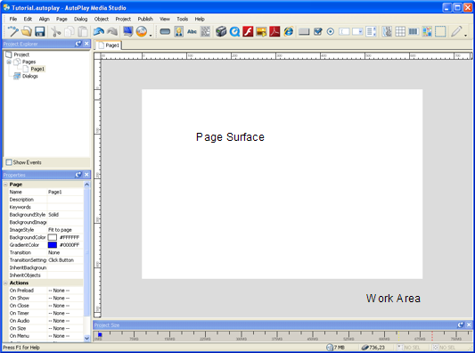
The page surface is shown in the middle of the work area. (Its the big white rectangle.)
When you click on the page surface, the pages settings are displayed in the properties pane.
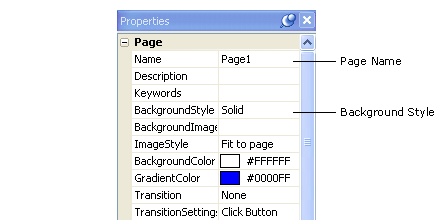
The properties pane
In the properties pane, you can see that this page is named Page1, and that its background style is set to Solid.
Tip: You can click on the page surface at any time to select the page and see its settings in the properties pane.
Since a big white rectangle is a bit boring for this project, lets make the page more interesting to look at.
The surface of the page is also called the page background. When you start a blank project, it has a single, blank page, and the background is the default background color for windows applications. By default the UseCustomSettings value is false. Click the dropdown and select true so we can customize the page's background settings.
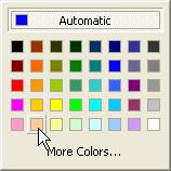
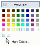
To set the background color to Pale Blue, click on the BackgroundColor setting in the properties pane, and then click the select button to bring up a color chooser.
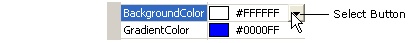
Click the Select button to choose a background color
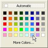
On the color chooser, hold your mouse over one of the color squares until the name of the color appears. (If you hold your mouse over a color square for a second or two, the name of the color will appear in a tooltip.) Now move your mouse around and look at the names of the other colors. Try to find the color named Pale Blue. (It should be the third color from the right on the bottom row.) Click on the color named Pale Blue to make it the new background color.
You can also set the color by editing the hexadecimal value directly. A quick way to do this is to double-click on the name of the text field (in this case, the BackgroundColor part itself), type in #99ccff and press Enter.
Note: Double-clicking on the name of a text field automatically highlights all of the text in the field for you. Whenever text is highlighted, anything you type instantly replaces the highlighted text.
Tip: When typing in hexadecimal color values, you don't have to use capital letters. AutoPlay will automatically capitalize the letters for you.
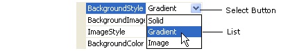
To change the pages background style, click on the BackgroundStyle setting in the properties pane, then click the select button and choose Gradient from the list.
To change the gradient color, click on the GradientColor setting, and then click the select button to bring up the color chooser. Find the color square named Tanit should be the second color from the left on the bottom row and click on it.
The page background should now be a gradient between the background color at the top (Pale Blue), and the gradient color at the bottom (Tan). A gradient is just a smooth blend from one color to another. So, the page surface blends smoothly from Pale Blue at the top, to Tan at the bottom. (I like to call this Desert Sunrise.)
Using a gradient is an easy way to create a simple, attractive background for the page.
Setting the background style to Image lets you specify an image for the page background. This does exactly what it sounds like: the image is stretched over the page surface, and any objects that you put on the page will appear on top of the image. (Well select a background image in a moment.)
Note that the background color changes from a gradient to a single color, specifically the BackgroundColor setting. This is the color that any uncovered parts of the page will have if the image style is set to Actual size and the image is smaller than page.
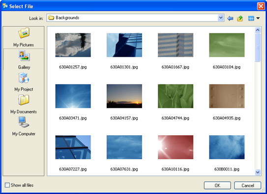
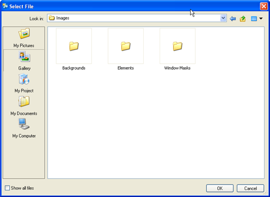
Selecting an image is done using the Select File dialog. To open the Select File dialog, click on the BackgroundImage setting, and then click the browse button.
When you click this button, a Select File dialog opens so you can browse for a file. Clicking the Gallery button on the left side of this dialog gives you access to the complete library of files that came with AutoPlay.
Click the Gallery button
Note: There are five buttons on the left side of the Select File dialog: My Pictures, Gallery, My Project, My Documents, and My Computer. The My Project button is for files that you've already added to your project; the Gallery button is where you'll find the files that came with AutoPlay; and the other three buttons let you bring in files from other locations on your computer.
Because AutoPlay knows that you're looking for a page background, when you click the Gallery button on the Select File dialog, it automatically takes you inside the Backgrounds folder.
Although you will find many nice backgrounds in that folder, you can navigate to another folder in the Select File dialog if you want.
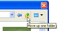
Navigating in the Select File dialog is just like browsing for files in Windows. To move back up or out of a folder, click the move up button at the top of the dialog.
The Move Up button
If you moved up to the parent Images folder, you would see the Backgrounds folder, along with two other folders in the AutoPlay image gallery.
The Backgrounds folder and its siblings as seen from their parent folder
To reach the files in the Backgrounds folder again, just double-click on it. When you double-click on a folder, you essentially go into that folder, revealing the folders contents (which can include files or even other folders).
As you can see, the gallery is full of useful images, including several high-quality abstract images that make excellent backgrounds. (Which is great for those of us whose artistic talent goes about as far as Desert Sunrise.)
Once you find an image that you like, click OK to select it as the background image. The Select File dialog will close, and the image will appear on the page as the background.
Note: The image you select automatically gets copied to your projects Images folder.
In the default window layout, the Gallery and Preview panes are not displayed. To show the Gallery pane, choose View > Panes > Gallery Browser. (There will be a check mark next to Gallery Browser in the View > Panes submenu when the Gallery pane is visible.) Next, make the Preview pane visible by choosing View > Panes > Resource Preview.
As in Windows folders, the gallery pane has a number of different views you can use to look at the files it contains. You can switch views by right-clicking on an empty spot within the pane, and choosing a different item from the View menu.
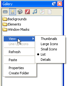
Different view options
Most of the screenshots throughout this users guide were taken using the List view. AutoPlay Media Studio uses the Thumbnail view by default.
Don't worry if your panes don't look like the ones in this users guide, you can switch to the List view everywhere if you'd like, but the other views provide the same basic functionality. Which view setting you use is entirely up to you.
The Gallery pane lets you browse the library of files that came with AutoPlay. This library is organized into different sections, each one accessible with a button at the top of the pane. Make sure you're viewing the Images section of the Gallery pane; if not, click on the Images button at the top to switch to it.
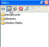
Click on the Images button at the top of the Gallery pane to browse for images
Navigating in the Gallery pane is just like navigating in the Select File dialog, or in Windows. To reach the files inside the Backgrounds folder, just double-click on it.
The Gallery pane gives you another convenient way to change the page background. Lets use it to change the background to a different image.
To make the 630B1151.jpg file the background image for the page, you can drag it from the Gallery pane onto the page surface.
Note: To drag the file, click on it with the mouse, and, keeping the left mouse button held down, move the mouse so the mouse pointer is over the page surface. (A little + symbol will appear next to the mouse pointer to show that you're dragging something.) When you let go of the left mouse button, the file will be dropped onto whatever is under the mouse pointer, in this case, the page surface.
Whenever you drag and drop an image that is larger than 75% of the page size, AutoPlay asks you if you want the image to be used as the page background. (An image that big would cover most of the page anyway.)
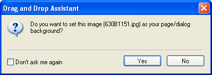
Click Yes to add the image as a page background
If you answer Yes, the pages Image setting will automatically be set to use that image as the background. (If you answer No, the image will be dropped onto the page as an image object.)
Tip: You can change the % size threshold and turn this feature on or off by choosing Edit > Preferences and adjusting the settings in the Drag and Drop category.
Another way to access page settings is by double-clicking on the page surface. Double-clicking on a page (or object) in AutoPlay opens a dialog with all of the settings on it.
The Page Properties dialog contains all of the settings that are available in the properties pane. As you can see, the changes that you made in the properties pane are reflected on the Page Properties dialog.
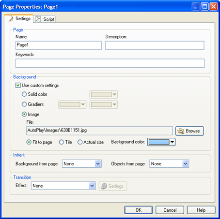
Page Properties dialog
Some people prefer double-clicking to make their changes, while others prefer to use the properties pane; the double-click dialogs are a bit easier to use in some cases, whereas the properties pane can be quicker at other times, such as when editing multiple objects at once. Feel free to use whichever method you prefer. (Most of us here at Indigo Rose use both.)
In this users guide, I've focused more on the properties pane, since as a relatively new interface it requires a bit more explanation...the double-click dialogs are more familiar to most users and should be self-explanatory.
Clicking the Cancel button closes the dialog and cancels any changes you've made while it was open. (In this case you didn't make any changes, so it doesn't really matter whether you click Cancel or OK, but it doesn't hurt to be careful.)
As nice as that background is, our project will be pretty boring if that's all there is to look at. Since a pictures worth a thousand words, lets start off by adding an image object to the page.
Choosing Object > Image automatically brings up the Select File dialog so you can choose an image to display in the image object.
Tip: The Select File dialog automatically opens to the same folder you were in the last time you browsed for a particular type of file (such as an image, or a video).
Clicking the Gallery button takes you directly to the gallery folder that is most convenient for the type of file you are adding. In this case, because you're adding an image object, the Gallery button takes you to the Gallery\Images\Elements folder which is where the file you want to add is located.
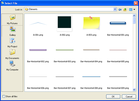
The Gallery\Images\Elements folder
When you select the A-001.png file and click OK, that image file is copied into your project folders Images subfolder. The path to this newly copied file is what will appear in the File setting on the Image Properties dialog.
Note that the original file isn't referenced directly. When you select a file, AutoPlay makes a copy of it and puts the copy in the project folder, leaving the original untouched.
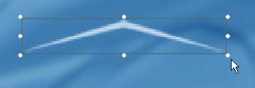
Once you click OK, the little pointed peak image is added to the page.
Note: When you add an object using the Object menu, the object is automatically positioned in the upper left corner of the page.
If you look closely, you'll see that the image is surrounded by a blue rectangle with a bunch of little white squares on it. This blue rectangle is the objects bounding box.
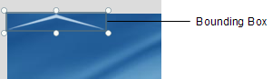
The bounding box appears whenever an object is selected. It shows you the actual size and position of the object. (As you can see, when you add a new image object, it gets selected for you automatically.)
Note: The bounding box is only visible at design time, when you're working on the project.
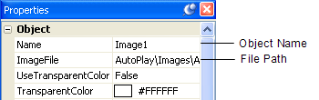
Another thing you'll notice when an object is selected is that its settings appear in the properties pane.
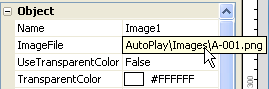
If you look in the properties pane, you can see that this object is named Image1, and the path to the image file is AutoPlay\Images\A-001.png.
Tip: If you cant see all of the text in a setting, hover the mouse over the setting for a moment and a tooltip will appear to reveal the entire contents.
Feel free to take a look at some of the other properties this image object has.
Clicking anywhere outside the selected objects bounding box deselects the object. Basically, it just selects something else, in this case, the page.
(You can tell that the page is selected because the page settings appear in the properties pane.)
When you select the image object, its bounding box reappears, and its settings appear in the properties pane again.
Note: To select an object, just click on it.
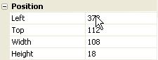
In addition, the objects current position and size are displayed on the status bar.
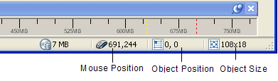
The numbers on the status bar indicate the current X,Y coordinates of the top left corner of the objects bounding box, and the current width and height of the objects bounding box, in pixels.
Moving an object is easy: just use the mouse to drag it where you want.
Note: To drag an object, first position the mouse pointer over the object. Then, grab onto the object by pressing (and holding) the left mouse button. Keep holding the left mouse button down while you drag the object by moving the mouse.
As you start dragging the object, a dotted rectangle will appear...this rectangle represents the object, and allows you to see where the object will be placed when you release the mouse button. (The object doesn't actually move until the end of the drag operation.)
Once you've positioned the dotted rectangle where you want the object to go, let go of the object by releasing the mouse button. As soon as you release the mouse button, the object moves to its new position.
As you move the object, the position readout changes on the status bar.

The numbers indicate where the top left corner of the objects bounding box will be when you let go of the mouse button.
Tip: Heres a neat trick: try holding the ctrl and shift keys down (together) before you start moving the image object. When the ctrl and shift keys are held down, an object can only move vertically or horizontally, whichever direction the object is moved in first. So, if you hold Ctrl+Shift and then start moving an object to the right, the object will only move left or right until you let go of those keys. (The same goes for moving it up or down.)
Tip: You can also move objects around using the cursor keys. (Graphic artists commonly refer to this as nudging the object.) This can be helpful when you want to fine-tune an objects position.
Don't worry, well add the image object back in the next step. But I wanted to show you how to remove an object from the page.
Note that this removes the object from the page along with all its settings, but doesn't actually delete the image file. As you'll see in the next step, a copy of the original image is still in your projects Images folder.
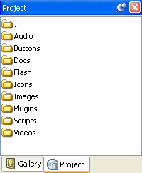
The Project pane
Once an image has been added to your project, it becomes even easier to add it a second time. This is because adding an image to your project creates a local copy of that file inside your projects Images folder.
Note: Every time you start a new project, AutoPlay automatically creates a project folder for you. Immediately inside the project folder are two things: the project file, where all the projects settings are stored; and a folder called CD_ROOT. The CD_ROOT folder is where all of your project files are organized. When you burn your project onto a compact disc, its the contents of the CD_ROOT folder that are placed on the CD. (In other words, everything below the projects CD_ROOT folder will end up on the CD when you publish your application.)
In order to keep things neat and tidy, the files that you add to your project are stored under CD_ROOT in a folder called AutoPlay. This folder is further divided into a number of subfolders. Images are kept in a subfolder called Images, Videos are kept in a subfolder called Videos, and so on.
Every project has a complete set of these subfolders, which you can access by using the Project pane. Most of the time, these subfolders are all you will ever see; while you're working on the project, you're working in the CD_ROOT folder. (You won't see the CD_ROOT folder itself unless you look for it in Windows.)
Heres how it works: whenever you add an image to your project, its copied into your projects Images folder first. Then the project uses that copy instead of the original. (Which is why the File setting is always a path like "AutoPlay\Images\redshoes.jpg" even if you added the file from "C:\My Documents\Graphics\Pictures" of clown feet.)
This is done so you're always working with a local copy of the file - one that wont be affected by any changes you (or someone else) might later make to the original. It also means that your project wont mind in the least if the original file is ever moved or misplaced. This makes your project much more robust. (So, if someone ever comes along and decides that a nice person like you doesn't need all those pictures of clown feet in the My Documents folder, AutoPlay's got you covered.)
Now, most of the time you don't have to worry about this - not even one iota. You just browse for the file you want, and let AutoPlay take care of things like copying files and making your project reliable. But, its good information to know, because it helps you understand why its so easy to add the same image to your project a second time around.
Note: If you aren't comfortable with files, folders and subfolders, just think of the Project pane as the place where you can see all the files that you've added to your project. The folders just divide the pane into different sections to keep your project files organized.
Since there are three image files that you've added to the project so far, you should see three files in the Images folder: the two images you used for the page background (including 630B1151.jpg), and A-001.png.
When you drag A-001.png onto the page, an image object is created automatically.
The little white circles on an objects bounding box are called resize handles.
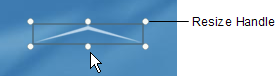
The resize handles appear on the bounding box whenever an object can be resized with the mouse. To resize the object, just drag one of the resize handles and make the bounding box bigger or smaller.


If you hold the ctrl and shift keys down (together) while you resize the object, the current aspect ratio will be maintained. What this means is that the width and height will both increase or decrease proportionally in order to keep the shape of the object the same. You can see this by watching the dotted rectangle that appears when you drag the resize handle. Normally, the dotted rectangle follows the mouse pointer exactly. When you hold the ctrl and shift keys down, however, the dotted rectangle maintains its overall shape as it increases or decreases in size.
Tip: You can also right-click on an object and choose Keep Aspect to make it always maintain its aspect ratio, even if you resize it without holding the ctrl and shift keys down.
As you resize the object, the size readout changes on the status bar.
The numbers indicate what the width and height of the objects bounding box will be when you let go of the mouse button.
Tip: You can abort a resize operation (in the middle of dragging) by pressing the Esc key.
You can set the position and size of an object directly by typing values right into the appropriate fields on the properties pane.
Tip: You can also reset an object to its original size by right-clicking on it and choosing Restore Size.
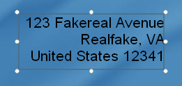
Some information is easier to present with words than with pictures. (For instance, it would be pretty hard to draw your name or email address.) Luckily, label objects make it easy to put text on the page.
Choosing Object > Label automatically adds a label object to the top-left corner of the page. Double click the new label object to bring up the Label Properties dialog so you can configure the new label object.
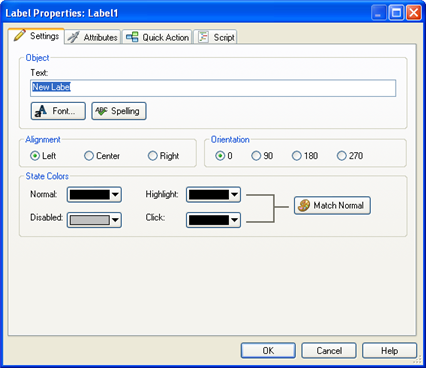
Label Properties
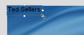
Note that the contents of the Text setting are automatically selected for you. This makes it easy for you to change the objects text right away. When you type in Ted Sellers, it instantly replaces the default text.

When you click OK, the label objects properties are updated.
When you resize a label object, the text inside it gets bigger or smaller. In fact, resizing a label objects bounding box is just another way of setting the objects font size.
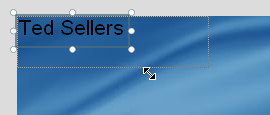
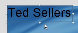
There are two things to remember about resizing label objects. First, label objects always maintain their aspect ratio as you resize them. (You probably noticed this as you were resizing the object.) This is because changing the font size changes the width and height of the text at the same time.
Second, the size of the label object may not always match the size you set it to. The bounding box might end up a tiny bit larger or smaller as the text snaps to the nearest font size. You wont always be able to get a label object to fit perfectly to a specific width and height in pixels...but AutoPlay will get the text as close as it possibly can.
Tip: When resizing label objects, try not to think in terms of pixels; instead, think in terms of points, as in a 12 point font. Or better yet, just resize the object until it looks the way you want it to, and forget about pixels and points altogether.
To make the label object smaller, just drag the same resize handle back to where it was before, more or less. (Don't worry about getting it exactly the same size; the point of this step is just to avoid having a big text object getting in your way during the next couple of exercises.)
You can also add an object by clicking the New Label Object button on the toolbar.
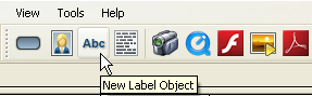
Clicking the New Label Object button is just like choosing Object > Label from the menu. It automatically adds a new label object to the top-left corner of the page. Since you already had a label object there, the result might look a bit jumbled, with one label object on top of the other. Don't worry about that for now; well move the new object in the next step.
Double-click the new object to bring up its Label Properties dialog. For now, we just want to change the default text to R E A L T Y L T D . (without the quotes). Note that we've put a space between each letter in order to spread the letters out a bit, and we've put two spaces between the words REALTY and LTD. to make them look like separate words.
Once you click OK, the text on the object is updated.
Moving the new object over makes it easier to see what's going on.
You can also add an object by right-clicking on the page surface and choosing the object type from the right-click menu.
Note: The right-click menu is said to be context sensitive in that it displays different items according to what you right-clicked on. For example, right-clicking on the page surface will present a different menu than if you right-clicked on an object.
This time, the object isn't added in the upper left corner...instead, it appears at the location where you right-clicked on the page.
Note: When you add an object with the right-click menu, it gets positioned where you right-clicked on the page.
Were going to use this object to display Teds email address, but for now the default text is okay.
A really quick way to add an object is to make a duplicate of an existing object. Duplicating is just like copying and pasting in Windows, only its combined into a single step.
When you duplicate an object, all of the originals settings are copied into the new object. The only things that change are the new objects name and position. In order to make it easier to keep track of everything, the new object is positioned a little bit down and to the right of the original. That way, you can see that the duplication was successful.
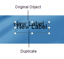
The new object is also automatically selected for you.
Duplicating objects is something you'll do pretty often, so it pays to learn the hotkey for the menu command.
Note: Most of the menu commands you can perform in AutoPlay have hotkeys assigned to them. If you look at the Edit > Duplicate command in the menu, you can see that the hotkey (Ctrl+D) is listed on the right. This makes it easy to remember what the hotkey is for duplicating an object, if you ever forget, just look in the menu.
Because the new object is automatically selected for you, you can create a chain of label objects very quickly by selecting an object and pressing Ctrl+D a few times.
Since the new objects start off with the same settings as the original, this is a great way to add a bunch of similar objects. Just set up the first object the way you want it, and duplicate it a few times.
Of course, you can do the same by repeatedly choosing Edit > Duplicate from the menu, but I find it much faster to press the Ctrl+D hotkey.
Now its time to put some real text in those three new label objects. First, though, lets spread them apart a bit so they're easier to work with.
Basically, just drag the bottom one down, and then position the middle one between them, so the objects don't overlap any more. More or less like this:
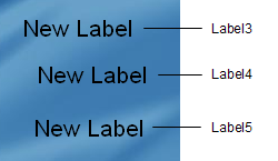
Separating the label objects will make it easier to select them in the next few steps, and to see what's going on. Plus, it might make them happy. (Label objects probably don't like being crammed together any more than you or I would.)
Well use this label object to display Teds email address.
Note: Don't worry if you don't click on the right label object at first. You might have to click on more than one label object to find the one named Label3. (Of the three objects with New Label on them, it should be the one closest to the top of the page.)
To change the text that is displayed in the label object, highlight the contents of the Text setting in the properties pane, and type in the text that you want it to display.
Tip: A quick way to highlight all of the text in a setting is to double-click on the left-hand column of the properties pane.
In this case, highlight the words New Label and type in [email protected] instead.
Note: Whenever text is highlighted, anything you type instantly replaces the highlighted text.
As you type in the new text, the objects bounding box automatically resizes to fit.
Well use the Label4 object to display Teds phone number.
Label objects are actually able to hold multiple lines of text. You can't just press Enter to insert a new line when you're typing stuff into the properties pane, though - there, pressing Enter means I'm done typing, keep the changes I just made. To get around this, AutoPlay gives you access to the Edit Text dialog, where pressing Enter starts a new line, just like it would in a text editor like Notepad.
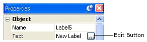
Once you click on the edit button, the Edit Text dialog will open, showing you the single line of text that the label object started out with.
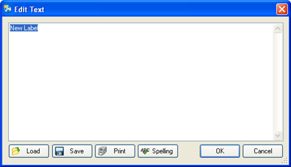
You want to replace that text with Teds fictional mailing address, so highlight all of the text and press the Delete key to remove it.
Tip: You can also click anywhere on the text and use the keyboard to edit it, just like you would edit something in Notepad: using the cursor keys to move around, and the Backspace and Delete keys to delete one character at a time.
As you type in Teds mailing address, make sure you press Enter at the end of each line.
Note: Pressing Enter actually inserts a newline into the text. A newline is a special character that basically marks the position where a new line of text should begin. The newline itself is invisible, but you can see its effects on the Edit Text dialog.
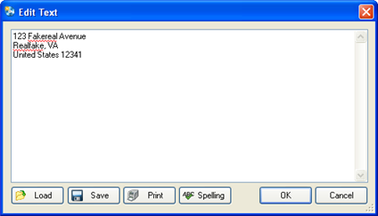
You may notice some red squiggles under the words Fakereal and Realfake. These red squiggles are the spell checkers way of alerting you that those words aren't in its dictionary. We don't care if they aren't, since the whole address is fake, but if you wanted to, you could click the spell check button to step through all such flagged words and choose from a number of suggested spellings.
When you're done typing the fake mailing address in, click the OK button on the Edit Text dialog. The text will be inserted into the label object, which will automatically resize to fit all of the text.
Note: If you look in the properties pane, you might notice that the Text setting actually contains the text that you typed into the Edit Text dialog. If you're wondering how AutoPlay manages to stuff 3 lines of text onto a single line in the properties pane, try clicking on the text field and then scrolling to the right with the cursor keys. As you scroll through the text, look for a backwards slash followed by the letter n, like this: \n. Those two letters are a special code that represents the newline character in places where you cant just press Enter to start a new line. You can actually edit the text in a label object right in the properties pane, by typing \n wherever you want a new line to appear. Of course, its a lot easier to just edit the text with the Edit Text dialog.
When you change the Alignment setting, the objects text lines up along the right side of the bounding box.
Note: Although you can set the Alignment for any label object, the effects of changing a label objects Alignment setting will only be visible if there is more than one line of text in the object, and the lines aren't all the same length.
Tip: You can center the text in a label object, too. Just for fun, try setting the Alignment to Center to see how it looks.
For this project, we want the mailing address to be left-aligned.
Tip: Two other objects that support multi-line text are the paragraph object and the rich text object. In fact, paragraph and rich text objects are often a better choice when you need to display multiple lines of text on the page. Although I've chosen to use label objects in this lesson for demonstrative purposes, you could easily substitute paragraph objects or rich text objects to achieve these effects in your own projects.
As you added the objects in this lesson, they were automatically given names based on the object type, along with a number to make the name unique - names like Image1 and Label4.
You've probably already noticed the pattern: as you added more objects of the same type, the numbers got bigger. When you added a second label object, it was automatically named Label2. When you duplicated that object to create a third label object, it was named Label3. And so on.
In fact, as you add more objects of the same type, the numbers just keep increasing. The more objects you add to a page, the bigger the numbers get. (Until one day you end up with an object named Label91238912381923 and you realize you have no life.)
This is done so that every object starts out with a unique name. AutoPlay uses the object names to distinguish one object from another, so they have to be unique.
Actually, consider that object naming rule #1: in AutoPlay, every object on the page has to have a unique name.
Okay.
But that doesn't mean you have to stick with the names that AutoPlay gives your objects. In fact, after a while, remembering which object is which can get a bit difficult if they all have names like Image9, Label6 and Label22.
Luckily, its easy to change the name of an object to anything you want. To illustrate the point, lets rename three of our label objects to make them a bit more memorable.
Since this label object contains Ted Sellers fake email address, it makes sense to give the object a name that reflects that.
To change the objects name, just edit the text in the Name field so it contains Email Address instead of Label3.
Note that its perfectly fine to include spaces in object names. Of course, you don't have to use spaces...we could have named this object Email, Address or label_email or even JimBob for that matter.
Tip: For some good advice on choosing names for objects, see Naming Objects.
You can rename these other objects the same way: just click on the object, and change the text in the Name field.
Or, you can change the name by double-clicking on the object (to open the Properties dialog), clicking on the Attributes tab, and then changing the Name setting there.
Note: Just because you can rename objects, doesn't mean you have to. For example, our page only has one image object on it, so we don't really need to give it a special name. (It shouldn't be too hard to remember which object Image1 refers to.)
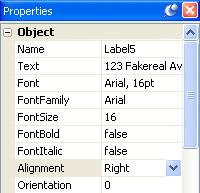
Every label object contains text, but that doesn't mean they all have to look the same. AutoPlay gives you full control over several font settings.
The Font dialog is where you can adjust all the font-related settings for the currently selected object.
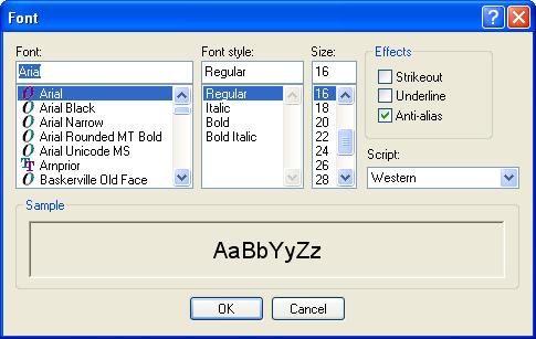
The first setting on the left side of the Font dialog lets you specify the font family you want to use. To switch to a different font, you can either type the name of the font into the text field, or select it from the list below.
To find Tahoma quickly in the list, select a name in the list (it doesn't matter which one), and press the T key. The list will jump to the first font that begins with the letter T. Tahoma shouldn't be too far away. When you find it, just click on it in the list to select it.
Similarly, to set the font style to Bold, just click on the word Bold in the list of font styles. To set the size to 36, either type in 36 in the Size field, or click on the number 36 in the list.
When you click OK, the label object will automatically use the new font settings.
Tip: You can also set some of the font settings in the properties pane.
Changing the orientation changes the direction that the text is written in.
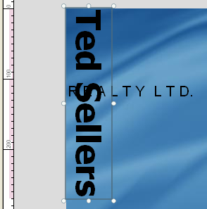
To illustrate this, well turn the Ted Sellers label on its side and make its text read from the top down, so it would read normally (from left to right) if you tilted your head 90 degrees to the right.
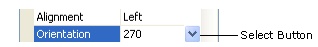
To do this, click on the Orientation setting in the Properties Pane, click the select button, and then choose 270 from the list. This will orient the text 270 degrees counter-clockwise, so that it is written vertically from the top down.
Pretty neat, eh?
Setting the label objects orientation back to 0 will return it to normal, so it reads from left to right without any head tilting. (This assumes you're not lying on your side or hanging upside down, but you get the picture.)
You can also change some font settings without opening the Font dialog, by using the four individual font settings in the properties pane.
These settings provide a quick way to change the most common font settings right from the properties pane. (As you'll see in lesson 3, these settings are especially helpful when working with multiple objects.)
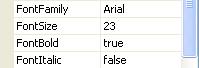
Changing the FontFamily setting is equivalent to choosing the font. In fact, what we normally consider the name of a font is technically referred to as the fonts family. Arial, Times New Roman, Garamond...each of these refer to a different font family. The reason they're called families is because they encompass all of the different variations within that font...such as Bold, Italic, etc. Each font is actually made up of a collection of different sub-fonts, one for each of the various styles within the family. The Arial family comprises Arial Bold, Arial Italic, Arial Bold Italic, and so on.
To change the FontFamily setting, just click on it, then click the select button and choose Arial from the list. (The same trick applies to this list - you can press the a key to jump to the first font name that begins with the letter A.)
To change the FontSize setting, either edit the text in the field to replace 36 with 23, or click the little up/down arrows to change the size one point at a time.
To change the FontBold setting, you could click on the setting, click the select button, and then choose true from the list. But theres an even easier way to change a true-or-false setting like this one: just double-click on the word false.
Tip: If a setting offers you a list of values to choose from, you can double-click on the current value to advance to the next item in the list.
If the current value is the last item in the list, it just goes back to the beginning. Since the FontBold setting only gives you two options to choose from - namely, true and false - double-clicking on the value goes from false back to true.
Tip: You can toggle a setting between true and false by double-clicking on it.
You can also change the font settings by double-clicking on the object to open the Label Properties dialog, and then clicking the Font button to open the Font dialog.
To change the font style, just select Bold from the list. To set the font size, either highlight the original size (16) and type in 12, or just select 12 from the list.
Clicking OK on the Font dialog will accept these changes and close the Font dialog.
Note: The Font dialog appears on top of the Label Properties dialog, and it must be closed before you can exit from the Label Properties dialog. Because the Font dialog is smaller, part of the Label Properties dialog will be visible behind the Font dialog. A common mistake is to click on the wrong dialogs OK button. Luckily, the Font dialog wont let you sneak around it like that. If you click the wrong OK button, the Font dialogs title bar will flash (and you might hear your computers alert sound). If this happens, just click the other OK button.
Clicking OK on the Label Properties dialog will accept the changes that you made to the object (i.e. the changes that you made to the Font settings) and close the Label Properties dialog.
Label objects don't have to be black and white. Far from it! AutoPlay lets you set four different colors for each label object - one for each of the three different states that a label object can be in, as well as a disabled color.
What's this about three different states?
Well, each object is able to display three different colors in response to what the user does with the mouse. Normally, when the mouse pointer is not over the label object, the Normal color is used for the text. If the user positions the mouse pointer over the label object, the Highlight color is used instead. And if the user clicks on the object, the Down color is used.
These three different situations - normal, highlighting and clicking, are the three states that the label object can be in.
So why three states? Well, it turns out that label objects can be made to do something when the users clicks on them, or moves the mouse onto (or off of) them. By using different colors for the three states, you can provide visual cues for the user to help them see that those label objects are interactive.
In other words, the three colors let you make label objects that look and act like hyperlinks, similar to the links you're used to seeing on web pages.
This is probably a lot easier to understand if you can see it in action, so lets turn one of our label objects into that kind of interactive label.
Note: There is actually a fourth state, too, for when the object has been purposefully disabled. This allows you to grey out an object to make it look unclickable when it has ceased to be interactive. You usually don't need to use this state, though, unless you're building a more complex application.

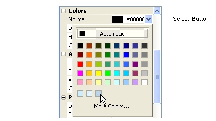
To open it, either double-click on the category heading, or click once on the little + symbol to the left of it.
Once the category is open, it will look like this:
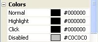
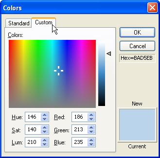
Double-clicking on a color setting highlights all of the text in it, so that what you type replaces the existing value. In this case, you want to change the default value of #000000, which is the hexadecimal color value for black, to #BAD5EB, which is the hexadecimal color value for a light blue-grey that looks good against the pages background image.
Note: When typing in hexadecimal color values, you don't have to use capital letters. AutoPlay will automatically capitalize the letters for you.
When you set the Normal color, you should see the label objects text change from black to light blue-grey.
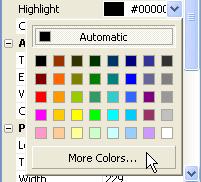
In order to make our label object look like a hyperlink, we want the highlight color to be a lighter version of the normal color. That way, the user will see the text highlight when they move the mouse over it. The color chooser doesn't have the color we want, though, so we need to go one step further. That's where the More Colors... link comes in.
Clicking on More Colors... at the bottom of the color chooser opens the Colors dialog.
The Colors dialog has two tabs: Standard, and Custom. The Standard tab, which is selected by default, has a broader selection of the standard Windows colors for you to pick from. In this case, you want to select the color that is immediately up and to the right from the color in the center.
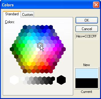
When you're done changing the color, click OK to close the Colors dialog. The color you selected will show up in the properties pane as the objects new Highlight color. You won't be able to see the real effect of changing the Highlight color, though, until you actually see the project running.
Note: The text color will change to the Highlight color when the user moves the mouse onto the object. Since the objects size and shape are determined by its bounding box, this means the color will change when the mouse pointer crosses over the edge of the bounding box (like crossing the border into the objects territory).
If you cant find the color you want on the Standard tab, you can switch to the Custom tab to create a custom color from scratch.
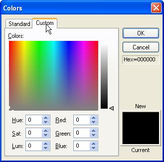
The Custom tab lets you select a color from a limitless palette, either by clicking on the color map, or by setting the Hue/Saturation/Luminosity or Red/Green/Blue values directly. If you've used any photo editing tools, you're probably already familiar with this interface, or have used one like it.
For the Click color, we want a color that is similar to the Highlight color, but a little bit lighter. Theres a really easy way to do this using the custom tab, but first we have to prime it with the Highlight color. (Right now, the Custom tab is showing the settings for the current Click color, which is black. Starting from scratch like this would make it harder to pick a color that is similar to the Highlight color.)
Going back to the Standard tab and selecting the same light blue-grey color that you selected in step 4 will set the Click color to that color. This doesn't actually change the objects Down setting...at least, not until you click OK and accept the changes. But it gives us a better starting point to create a similar color for the labels Click state.
When you return to the Custom tab, you'll see the color settings for that light blue-grey color.
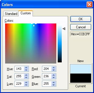
The luminosity slider is the vertical bar with the little triangle next to it, just to the right of the big color map. You can drag the triangle up and down to change the colors luminosity, without changing its saturation or hue.
Pick a color that is noticeably brighter than the Highlight color. (I set the luminosity to about 239, which resulted in a color whose red, green and blue values were 224, 243, and 255, respectively.)
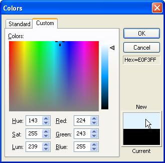
When you click OK, the Colors dialog closes, and the color you created shows up in the properties pane as the objects new Click color. Once again, you wont be able to see any other effects of this change to the object until you see the project running.
Note: The text color will change to the Click color when the user clicks inside the objects bounding box.
Copying a color from one object to another is something you'll do fairly often. Luckily, AutoPlay gives you two really fast ways to duplicate a color.
To demonstrate this, lets make our Phone and Mailing Address label objects use the same color as the Email Address objects Normal color.
The first way to give two color settings the same value only works if you used the Colors dialog to set the first color. This is because the color chooser actually keeps track of the last eight colors you added with the Colors dialog and makes it easy for you to select them again.
In the previous exercise, you used the Colors dialog to set the Highlight and Click colors for the Email Address label object. Whenever you choose a color using the Colors dialog, a new color square is added to the bottom row of the color chooser.
As you can see, there are two such color squares on the bottom row of the color chooser: one from when you chose the Highlight color, and one from when you chose the Click color.
There is no color square for the Normal color, though, because it wasn't set using the Colors dialog. That color was changed by typing the hexadecimal color value directly into the Normal setting. Only colors that are set using the Colors dialog will show up on the color chooser.
In order to create a color square for the Normal color, we need to set it again using the Colors dialog.
When you switch to the Custom tab, the color settings contain the values that describe the current color.
Since the Email Address label objects Normal color is already set to the color we want, all you have to do is click OK on the Colors dialog, and you'll effectively "re-set" the Normal setting to the same color - only this time, in a way that will result in a new color square being added to the color chooser.
When you re-selected the Normal color using the Colors dialog in step 2, a new color square was added to the bottom of the color chooser.
This new color square will be available in all color choosers until you exit AutoPlay. So, if you want to use the same color somewhere else - in another label object, for instance - you just have to click on that new color square.
Clicking on the color square sets the Normal color for the Phone label object to the same color you chose for the Email Address label object.
Note: As you continue to select colors using the Colors dialog, additional color squares will be added to the bottom row of the color chooser. The color chooser will only remember as many colors as it can fit on the bottom row, however. If you select enough colors, the color chooser will forget the older ones in favor of the new ones. In other words, the color chooser can only show the last eight custom colors that you picked.
The other way to duplicate a color is to copy and paste the hexadecimal value from one setting to another.
When you double-click on a color setting, all of the text in its text field is highlighted for you. In this case, the text is the hexadecimal value that describes the Normal color.
Pressing Ctrl+C copies this text into the clipboard so you can paste it somewhere else.
Once again, when you double-click on the Normal color setting, its hexadecimal value is highlighted. Pressing Ctrl+V pastes the text from the clipboard into the text field, replacing the highlighted text.
Note: This time, instead of copying the hexadecimal text into the clipboard, you're replacing it with the value that you copied from the other label object.
Tip: Unlike the new color square on the color chooser, which only works for colors that you've selected with the Colors dialog, you can always copy and paste the hexadecimal value between two colors.
To accept the change that you made to the Normal setting, you can either press the Enter key, or click away from the Normal setting. (In other words, click on another setting, or another object, or on the page surface.)
Tip: If you wanted to cancel the change, you could press Esc instead.
Unlike the Email Address object, we don't want these labels to appear interactive, so we need to make all three state colors the same. Otherwise, the text colors will change when the user moves the mouse over the labels or clicks on them, which will give the wrong impression.
To make all three colors the same, you could just copy the hexadecimal color value from one of the states and then paste it into the other two - just like copying a color from one object to another. But there's an even easier way to make the colors match: just use the Match Normal button on the objects double-click dialog.
Double-clicking on the label object opens the Label Properties dialog. There are four color choosers on the Settings tab which allow you to set each of the four state colors, just like you can in the properties pane.
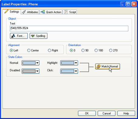
Next to the Highlight and Click colors is the Match Normal button.
Clicking the Match Normal button makes the Highlight and Click colors both match the Normal color.
Clicking OK closes the dialog and locks in the new Highlight and Click colors.
Double-click on each Mailing Address label object and make its Highlight and Click colors match its Normal color, too.
While were at it, lets change the color of our first two label objects as well.
The Label1 object is the one with Ted Sellers on it. In the next lesson, were going to use it with Label2 and the image object to create a little logo. Since its going to be used as part of a logo, we don't want it to appear interactive, so the Normal, Highlight and Click colors should all be the same.
The Label2 object is the one with R E A L T Y L T D . on it.
Remember when I mentioned that duplicating an object was a good way to add a similar object to the page? Essentially, you use an existing object as a starting point to create a new one. Lets take advantage of that trick to add another label object with the same color settings as our Mailing Address label object.
Well use this label object to display Teds slogan: Building communities one home at a time.
Pressing Ctrl+D creates a duplicate of the Mailing Address object, and automatically selects the new object.
Moving it away from the Mailing Address label object will make it easier to see what's going on.
Were starting to accumulate a fair number of objects. We might as well give this object a name so the list in the object browser doesn't get too confusing.
Clicking the edit button in the Text setting opens the Edit Text dialog. When the dialog appears, all of the text in it is already highlighted for you. To replace the text, you just have to type in the new text.
When you're done changing the text, click OK to close the Edit Text dialog. The new text should appear in the label object immediately.
We want the text in the label object to be centered, and we don't want it to be very big.
This positions the object down near the bottom left corner of the page.

Note: This will place the slogan below the four button objects well be adding in Lesson 4.
That's it...we don't have to bother changing any of the colors, because all of those settings were already made for us simply by duplicating the object.
If you've been using computers for a while, you know that its important to save your work from time to time. If you haven't, take my word for it: save your project, and save it often!
(In a perfect world, computers would never crash, and kids would never think the power button was really fun to play with.)
So, before we finish off this lesson, lets take a moment to save the project.
Note: When you save the project, all of the changes that you've made to the project are stored on your hard drive, in a project-specific file known as the project file.
Congratulations! You've just protected yourself from having to redo everything in the event that a computer glitch (or four-year-old) causes your computer to spontaneously shut down.
As you can see, there isn't much to it. Feel free to save the project as often as you want. Generally, the more often you save the project, the better.
Tip: You can also save the project by pressing the Ctrl+S hotkey.
Now that we've added some text and graphics, lets see how our project would look from the users perspective. AutoPlay's preview feature makes it easy to take a quick look at how your application will look and operate when its done, without actually building or burning the project.
When you choose Publish > Preview, your application starts up, just like it would if you built the project and ran it.
Previewing doesn't make any changes your project, so feel free to preview your project at any time.
Tip: You can also preview your project by pressing the F5 key, or by clicking the Preview button on the toolbar.
The Email Address label object is the one with [email protected] on it. As you move the mouse over this object, the text color changes from the Normal color (light blue-grey) to the Highlight color (a lighter shade of blue). When you click on the object, the text color changes from the Highlight color to the Click color (an even lighter shade of blue).
As you can see, all you need to do to make a label object appear interactive is set the Normal, Highlight and Click colors to different colors.
Note: In Lesson 4, well show you how to make this label object actually send an email when its clicked.
Since you made all three of the Ted Sellers label objects colors the same, it doesn't visibly respond to mouse-overs or clicks at all.
When you exit the preview, you're returned to the AutoPlay program window.
Tip: You can also press Alt-F4 to exit from a preview.
Lesson 2 Summary
In this lesson, you learned how to:
Change the page background
Add an image object
Resize
Add label objects
Duplicate objects
Change the text in a label object
Rename objects
Use custom font settings
Use different text colors
Copy a color from one object to another
Match an objects normal, highlight and click colors
Save the project
Preview the project